No clear hierarchy
Consumer, personalised and business offers competed before customers knew where to begin.

Funky Stickables · Ecommerce experience
A retrospective of the live experience review, homepage strategy and redesign direction. The connected shopping journey remains the next opportunity.
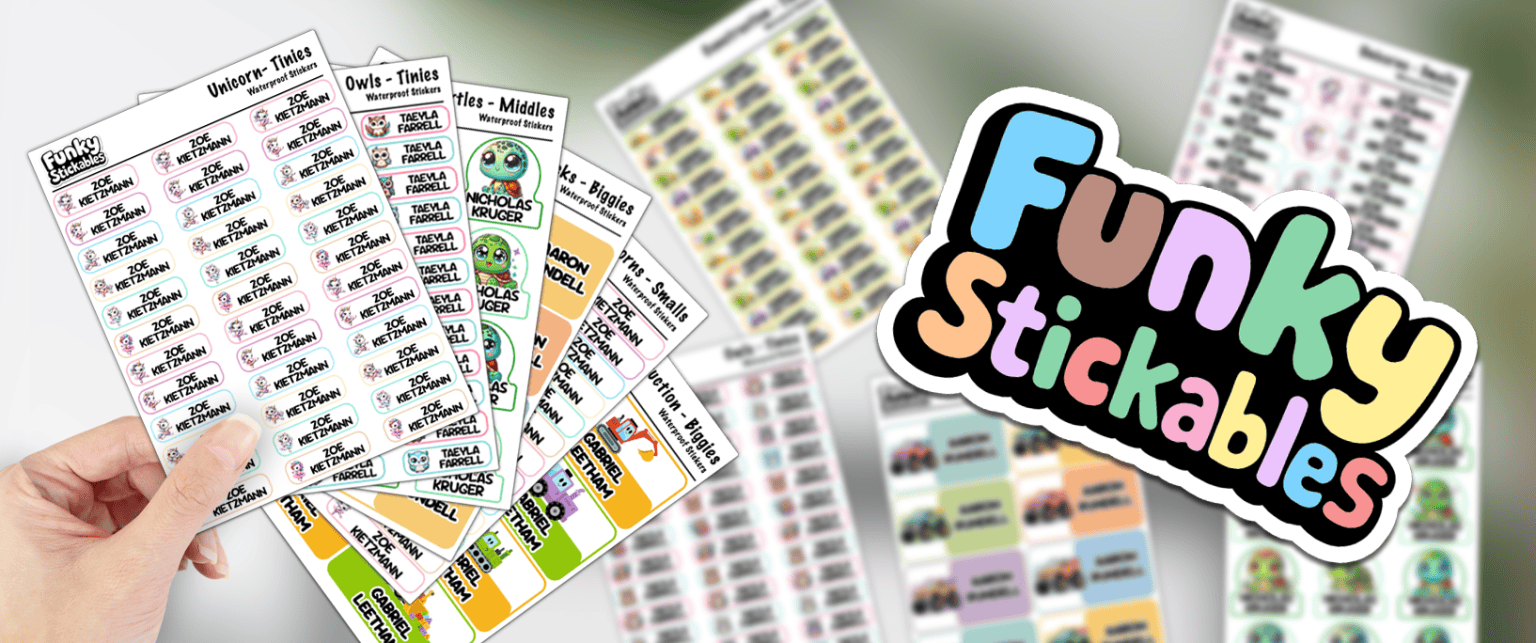
Funky Stickables serves parents preparing for school, customers choosing personalised products, people browsing fun stickers and small businesses needing custom print. The live homepage presented all of those offers, but repeated promotions and a long page made the best starting point difficult to identify.
The work focused on a practical question: how could the website make a broad range easier to understand without flattening the personality that makes the brand recognisable?
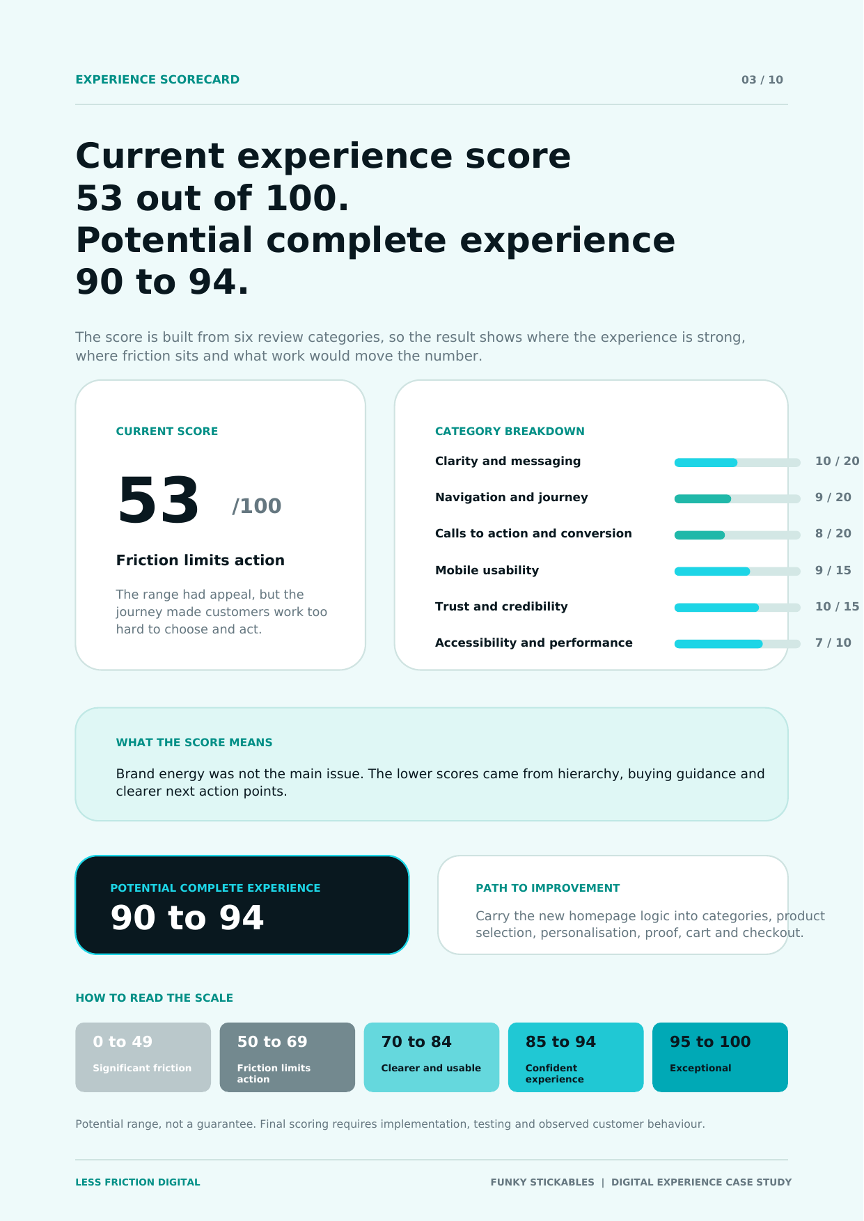
Experience score bands
The score bands are built from individual category scores, not a single gut-feel number. They show where strengths sit, where friction sits and why the overall experience lands in that range.
Visual energy and product breadth were strong, but clarity, hierarchy and buying guidance pulled the weighted score down.
Brand energy and range appeal were visible. The issue was helping different customer types choose where to begin.
Possible after the new logic continues through categories, personalisation, proof, cart and checkout.
Potential range, not a guarantee. Final scoring requires implementation, testing and observed customer behaviour.
What we reviewed
We examined the current homepage structure, navigation, product discovery and a personalised product page. The findings shaped the homepage direction and the downstream roadmap.
Consumer, personalised and business offers competed before customers knew where to begin.
Long content and recurring calls to action increased effort without improving the decision.
Personalisation offered flexibility, but the interaction needed stronger defaults, preview and guidance.
Reviews, social destinations and reassurance needed to connect to evidence customers could trust.
Image descriptions, focus behaviour, contrast and image weight required deliberate checks.
Category and product pages needed to continue the homepage decision logic rather than make customers begin again.
The design direction
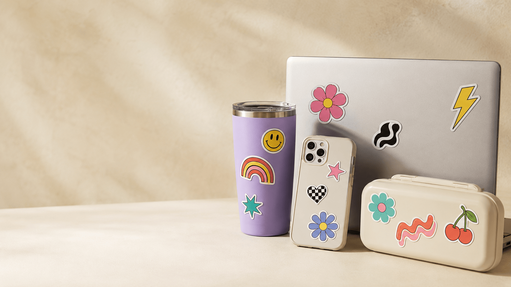
The redesigned homepage organises the range around customer intent: Personalised, School, Fun Stuff and Business.
The next phase
The public case study identifies the areas of work while detailed layouts, decision rules and component specifications remain confidential.
Reduce duplicated routes and organise ranges around customer intent.
Lead with outcome, proof, price and delivery, then reveal supporting detail.
Use a guided sequence with preview, useful defaults and clear validation.
Preserve selected choices, reinforce delivery confidence and remove avoidable decisions.
Replace unverified proof, resolve links and accessibility basics, then complete responsive homepage QA.
Rebuild category hierarchy, redesign product templates and create guided personalisation.
Simplify checkout, validate behaviour and improve retention using real evidence.
Sample client report
The sample report shows the review logic, category-based scoring, selected findings and recommended roadmap. Detailed page specifications and implementation decisions remain confidential.
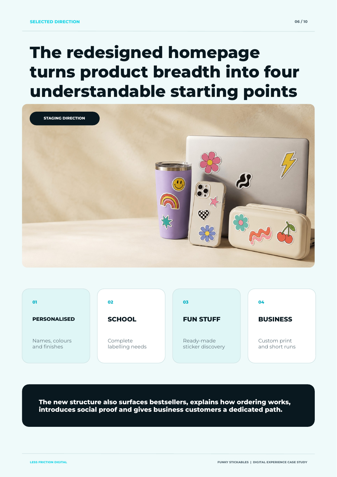
The staging homepage demonstrates a stronger entry into the range. It surfaces the main audiences, explains how ordering works, introduces trust signals and gives business customers a dedicated path.
The case study does not claim that the complete ecommerce journey has already improved. The next gain depends on carrying the same clarity through product selection, personalisation and checkout, then measuring what customers actually do.
Bring us your experience →A clearer digital experience starts here